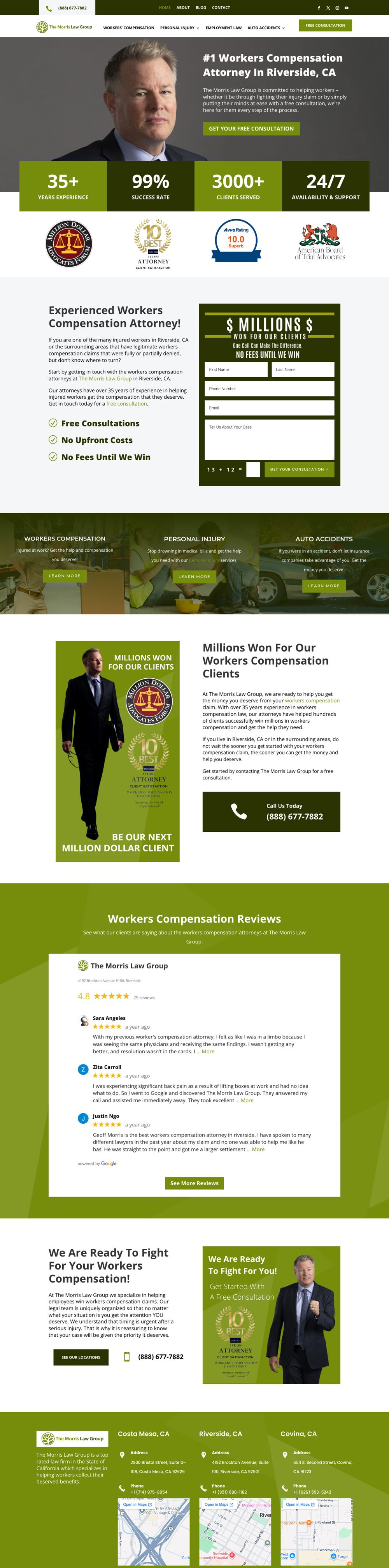
Brand style guide
The Morris Law Group
Workers' compensation and personal injury firm · 3 Southern California offices

01 Logo


- Keep clear space equal to the height of the tree mark on all sides.
- Minimum width: 180px on screen. Below that, use the tree mark alone.
- Never recolor, stretch or place the full-color logo on photography without a solid backing.
02 Color
- Leaf Green
#7D9207RGB 125 146 7Logo, CTAs, stat blocks - Forest
#3B540CRGB 59 84 12Wordmark and mark ring - Deep Olive
#2A3301RGB 42 51 1Dark sections, footer, body text - Charcoal
#333333RGB 51 51 51Headings on light - Cloud
#F5F6F7RGB 245 246 247Section backgrounds - White
#FFFFFFRGB 255 255 255Base, cards, form fields
03 Typography
Aa
Open Sans
Headings 800 / 700 · Body 400–500 · Buttons 700 uppercase
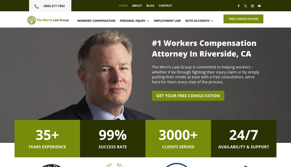
#1 Workers' Compensation Attorney in Riverside, CA
Experienced, Local, and On Your Side
If you were injured on the job and your claim was denied or underpaid, we'll fight for the benefits you're owed. Free consultation, and no fees until we win.
04 Live site UI
05 Voice
- Use plain language and lead with "free consultation" and "no fees until we win."
- Speak to the injured worker's situation first, then to the firm's experience.
- Avoid legal jargon and anything that reads like a guaranteed outcome, which State Bar advertising rules don't allow.
06 Approved pairings
| Aa | Forest on White | 8.54:1 | AAA |
| Aa | Deep Olive on Cloud | 12.34:1 | AAA |
| Aa | White on Deep Olive | 13.36:1 | AAA |
Leaf Green leads on CTAs and stat blocks. Deep Olive anchors dark sections and the footer.